
What a good main image score actually looks like
"Main image" sounds like one decision. It's actually seven or eight smaller ones, most of which are easy to check and easy to get wrong.

When we score a main image against the top-ranked listings in a category, the gap is almost never one dramatic thing. It's a handful of small, checkable choices stacked against you at once — each one worth a few points, none of them fatal alone.
Here's what separates a main image sitting in the low 60s from one scoring in the low 90s, in the order we actually check them.

Frame fill
This is the single largest swing factor we see. A product shot at 55–65% of frame reads as small and unconfident next to a competitor filling the square — even when it's the exact same product, same background, same lighting.
The fix is almost always just cropping tighter than feels natural. If it looks slightly too close on your monitor, it's probably about right on a phone.

Background purity
Off-white, gray-white, or a soft gradient background all read as "almost compliant" rather than clean. Buyers register this even when they couldn't name what's off about it.
This is a five-minute fix in post if your studio lighting was close, and one of the highest-leverage line items on the list.
No added text or graphics
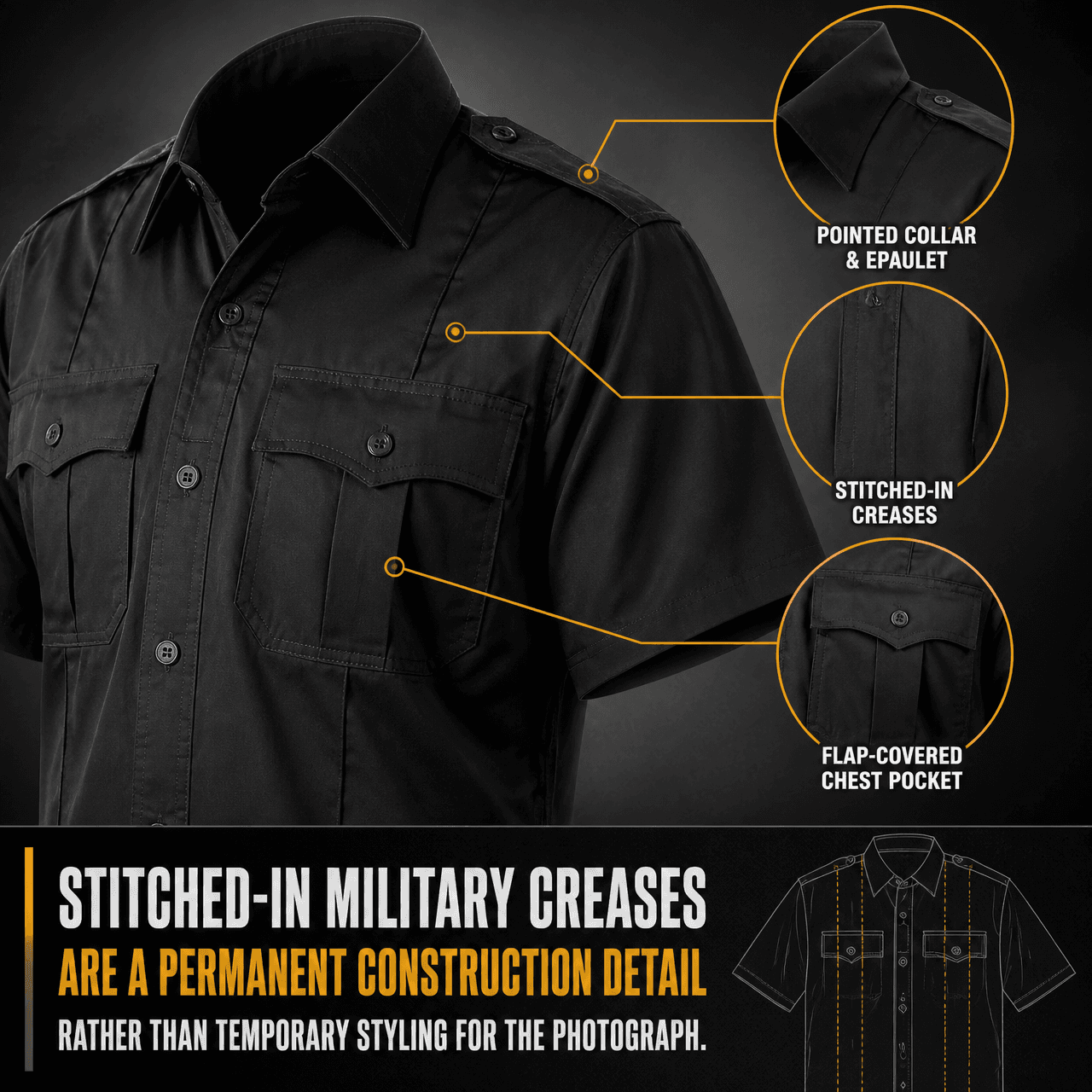
Badges, starbursts, and callout text belong in slots two through seven, not the main image. Beyond the policy risk, overlay text on the main image consistently scores lower in our comparisons — it reads as trying too hard before the buyer has even clicked in.

Shadow and depth
A product floating with zero shadow reads as a cutout, not a photograph — even on a pure white background. A single soft, correctly angled contact shadow is enough to make the image feel real without violating the plain-background requirement.

Color accuracy
Studio lighting shifts color more than most sellers expect, and a main image that's noticeably warmer or cooler than the real product is a direct line to return-driving disappointment, not just a scoring ding.
This is worth a hardware color-checker card in the shoot, not just eyeballing it against the product in hand.

Consistency across variants
When a listing has multiple colorways, mismatched framing or lighting between variants reads as a rushed catalogue rather than a considered one — and it's one of the easiest things to fix once you're generating variants instead of reshooting them.
Individually, none of these six checks are dramatic. Stacked, they're the entire distance between a 62 and a 94. Run through them in order on your own main image before you assume the fix is a bigger, more expensive reshoot.